The last newsletter outlined how Design struggles to be legible within businesses, because so many of its practices (and its most impactful practices) are indeterminate. A common, and reasonable, response was to ask, "How do we make design more legible?"
Before we get specifically to design, it's good to ask ourselves: What are kinds of things can be legible? I believe they are: Practices (how we work), Outputs (artifacts, processes), Outcomes (e.g., measured changes).
Remember, legibility is a condition of the perceiver, not the thing being perceived. As explained in the last newsletter, it was the bureaucratic state which determined that the only legible aspect of the German forest was 'board feet.' Similarly, in many businesses, the primary legible aspect of design is "screens given to engineering."
So, to increase the legibility of UX/Design is to change how it is perceived, which involves two processes:
- better connect the work of design to what is currently legible
- redefine what's legible to include more of the work of design
Connect the work of design to what is currently legible
As I wrote in the last newsletter:
Organizations value predictability, so that they can plan, budget, and communicate likely outcomes to their stakeholders. Predictability requires determinacy, where the nature of the work (its processes and outputs) are understood ahead of time—engineering will take 6 weeks to work through these Jira tickets; marketing will spend $50,000 to draw this amount of traffic. Determinacy in turn defines legibility, the qualities of work that can be seen, appreciated, valued, and accounted for.
Most organizations over-focus on screens because they are obviously determinate: clear outputs that fit within a process, that can be accounted for in systems, and can be literally seen. There are many other determinate aspects of UX/design that could be made legible, but require more effort to do so.
The shortcoming of generic UX metrics
In an effort to make UX/design more legible, people have developed a range of methods and metrics to quantify the user experience. These include:
- Expert usability evaluation scores, like PURE, which uses heuristics
- Self-reported / Attitudinal surveys, notably SUS and UMUX
- Usability measures, like time-on-task, task completion rates, and error rates
What's seductive about these approaches is that, for the UX/design team, they're straightforward to set up, requiring little to no effort from others, and turn the amorphousness of "user experience" into something determinate.
However, just because something is determinate does not mean it's legible. Legibility requires the assessing entity to 'see' the value in the metric. In the German forest, there are many potentially determinate aspects, but only "board feet" was legible, because its value was already understood.
In an organization that already places value on 'user experience,' these metrics will be seen. But in one that doesn't, these metrics may come across as vanity metrics, more evidence of the insularity of UX/design.
Connecting to what's already legible
UX/Design leaders must identify what is already legible, where the business finds value and so can 'see'. Years ago, I attended a talk by Satyam Kantamneni, where he shared that at Harvard Business School's executive MBA program he learned that businesses seek "adoption, retention, satisfaction, engagement, and efficiency,"* and which just happen to be the very things that user experience drives—it's just that we don't make the connection explicit.
*It only recently dawned on me that this is basically the same as Google's HEART framework: Happiness (satisfaction), Engagement, Adoption, Retention, Task Success (efficiency).
It turns out that seeing these qualities as 'legible' is actually a sign of relative maturity, because these are all proxies for value. Meaning an interpretive step has to be taken that connects these user behaviors and sentiments to business value, such as revenue, reduced costs, market share.
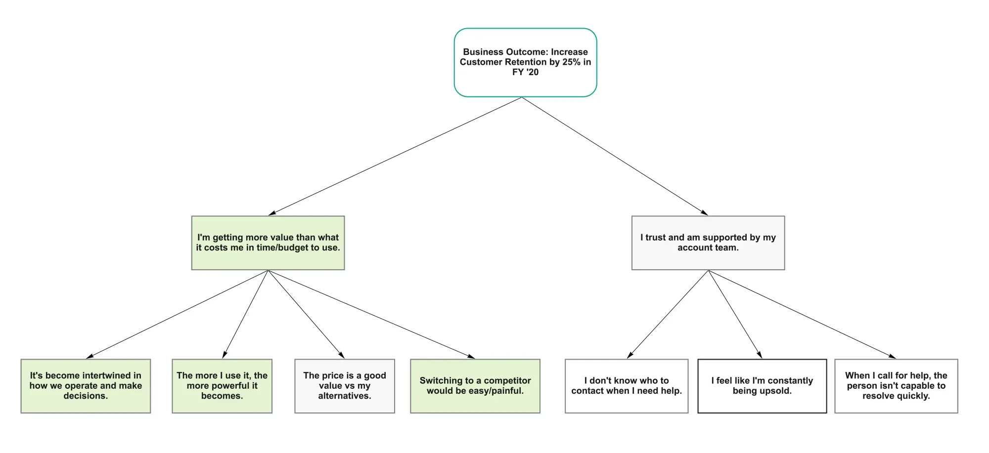
Less mature businesses only see direct business value as legible. A coaching client recently shared how product teams' primary objective was increasing annual recurring revenue (ARR). This put me in mind of the article I cite most often, "Empower Product Teams with Product Outcomes, not Business Outcomes," where Hope Gurion points out that business outcomes are lagging indicators that are largely out of the control of product teams.
As the article suggests, a way to make your work legible in these businesses is to decompose business outcomes into something product teams can directly affect, using opportunity trees, such as:
A similar mechanism for increasing the legibility of design is something we developed at Adaptive Path over 20 years ago, which we called Linking Elephants. It was developed for our report "Leveraging Business Value: How ROI Changes User Experience," written by Scott Hirsch, Janice Fraser, and Sara Beckman.
We had a financial services client who had identified potential business opportunities: Widen the relationship (by adding accounts, so if you have a banking account, you add a credit card); deepen the relationships (more money in each account); Customer satisfaction (this can be measured through many means: CSAT, reduced customer service calls). We used the linking elephants to connect those business opportunities to a user behavior that design could affect, and showed how that behavior drove desired value.
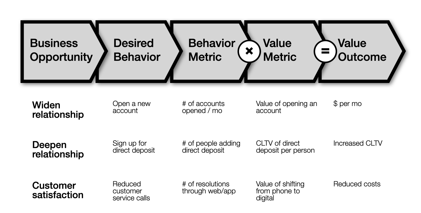
For each opportunity, we then worked with analytics and finance to hypothesize impact.
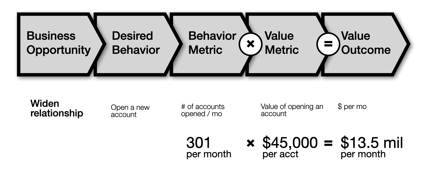
In this example, we figured .01% of visitors would open an account, which amounts to 301 per month. Our finance contacts shared that each new account open adds $45,000 in customer lifetime value (CLTV). Multiply those two numbers gives you a potential value outcome of $13.5 million in CLTV per month.
These connections made our work very legible to the business. It helped the client secure an additional $20 million for their website improvements.
Whether using opportunity trees, linking elephants, or some other mechanism of connection, there undoubtedly exists plenty of untapped existing legibility you can demonstrate by making your efforts determinate.
Redefine what's legible to include more of the work of design
To unlock design's potential, it's insufficient to operate within typical definitions of legibility. To account for the fullness of design, legibility must be redefined to account for its indeterminate aspects, particularly in its practice.
The instinct, having just made the determinate parts legible through measurement, is to keep going — build metrics for the practice work, too: count the number of directions explored, discovery hours, participants in research, etc.
While such effort metrics may be helpful within design (as an indicator of engaging more robustly in the practice), they won't make the work legible to anyone outside design who doesn't already believe that the effort produces value. In fact, this effort comes across as navel-gazing, or, even worse, as vanity, and I'm seeing design teams dismissed by business leaders who see such efforts as further demonstration of design's disinterest in driving business value.
So, how do you get non-designers to see the practice as legible? It's not a matter of translation or connection—instead, you want to convert them. And you convert them through direct experience—you put people inside the work. I have seen two means of achieving this.
Direct exposure to customers/users. A research report, while potentially legible, is cool—it doesn't incite empathy. But having non-designers in the room when someone shares their complicated workarounds in order to use a tool effectively, or observing the one-two-three-four-five-six-seven-eight-nine-ten-eleven-twelve seconds of hesitation before someone clicks, only for them to realize it's not what they expected—that shifts what had been illegible into focus.
Here's an irony—there's quantifiable evidence that this works! 15 years ago, Jared Spool argued that teams need a minimum of two hours every six weeks watching users, and that the correlation with better outcomes holds across the teams he's studied. There's an important detail for our discussion here, and I'll quote it in full:
...[W]e worked with teams where only the designers and developers were having regular exposure to their users. Stakeholders, such as product managers and executives, along with other non-design folks, like technical support liaisons and quality assurance management, didn’t participate in the field studies or usability tests. While the core design team became very familiar with what users needed and wanted, they were constantly battling with these other individuals who didn’t have the same experiences.
For these other individuals, the findings remained illegible, as they were not a first-party to them. This reveals that exposure isn't a research practice, it's an organizational one.
Participation in design activities. Workshops, Google-style sprints, co-design sessions. Here non-designers experience the process firsthand—why you need to generate twenty ideas to get one that's worth pursuing, tradeoffs necessary in order to meet the needs of a range of users, how strategies are materialized as artifacts. That direct engagement opens their eyes to the unseen work, and the rigor of the process (it's not just some designer doing what they think is cool).
Maintaining legibility requires vigilance
It takes significant effort to connect design work to existing frames of legibility, and then to broaden the aperture of what is deemed legible. And this effort is on top of whatever is actually expected of design leaders in their job. And so, when greater legibility is realized, it's tempting to call it a win, and move on.
But, over time, that legibility decays. So design leaders must remain vigilant in legibilizing design work.
An under-appreciated organizational force is turnover. As new people join, they bring with them their legibility lens, borne of experience in prior companies. And, given the state of the industry, for most of them, most of the work of design will be illegible.
So, companies must operationalize design legibility. Apple created Apple University in 2008 to maintain it's idiosyncratic (and design-driven) culture in the world of tech. In her appearance on Finding Our Way, Kaaren Hanson shared the importance of identifying existing operating mechanisms and implanting them with human-centered concerns:
...[T]hat’s where those operating mechanisms count so damn much.... If you’re having to report out on your CX metrics and the CEO is gonna read it, even if the CEO changes that helps to hold it all together....
You can build the best damn design team in the world. If you’re not changing the operating mechanisms, it doesn’t matter. And it’s not gonna last long. And the worst thing that happens if you’re a design leader is you do something, you walk away, in six months, it’s gone.
In the overwhelming majority of organizations, a design leader's work in this regard is never done. It may not be what you want to hear, but, as I often quote Lester Freamon: